We’ve Changed Our Look – Let Us Know What You Think
May 30, 2018We have been spending all of our time working on content and reaching out on social media sites that we haven’t really given the look of this site much consideration. When I visited it recently, I felt it was lacking in design and kind of off-putting. Based on my perception, We’ve changed our look. Let us know what you think.
Any comments (friendly, rude, blunt, etc.) are welcome. We really want to make this site all it can be.
THIS POST MAY CONTAIN AFFILIATE LINKS. PLEASE SEE OUR AFFILIATE DISCLOSURE FOR MORE INFORMATION.
 What do you think of the layout?
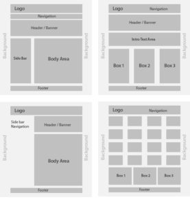
This is a WordPress site and, as such, there are many themes to choose from. My original theme was Skin and it was nice but, as I added articles and such to it, it looked a little plain to me. I took some time yesterday to look at some other theme options and I’ve picked one that I think will make the site pop a little more. If you don’t mind, please take a moment and look at the home page and one or two articles and let me know what you really think (good or bad) by commenting below.
Be as specific as you can as to why you like x, don’t like y or think z should be moved to spot 1, etc. I want to make this site pleasant to visit and easy to navigate but still provide useful information up front.
 What do you think of the content?
While you’re looking at a couple of articles, please post your thoughts on them. Do you like them, hate them, think something is missing or unnecessary, etc.? The more I know about what you think of my content the better I’ll be able to tailor it to your needs. If you choose to comment on articles in this post please list the title of the article. You can also comment on the article directly in which case you won’t need to provide the title.
 What would you like to see added or removed?
This goes for layout as well as content. Do you think I should change the side bar shown in the articles? If so, what should be moved, added or deleted? What do you think of the content of the home page? Should I move the layout around or change how a category is displayed? The nice thing about this theme is it’s very customizable. What works for you and what doesn’t. How does the flow of information work for you?
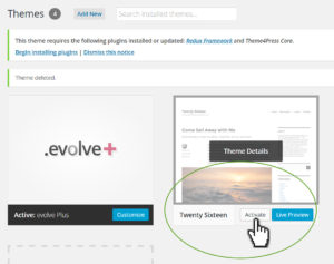 Do you think a completely different theme would be better?
For those of you familiar with WordPress or have visited other WordPress sites, do you have a theme you think might suit this site better? Now’s the time to let me know as I’m focusing on appearance as well as content (usually I’m just content focused). There are thousands of options when it comes to themes so I know I haven’t seen them all. If you have one you think is better I want to know about it.
Conclusion
So, now that we’ve changed our look, we’d really like you to tell us what you think. I’m a little excited, but at the same time worried, as to what answers I’m going to get from this post. I’m hoping you like it but I definitely want to know what you don’t like about it so I can make it a better experience for everyone. I know tastes differ from person to person but I’m hoping to find a happy medium to fit this site into.
Thank you very much for taking the time to look at this site and give me your feedback.
Scott Hinkle
MavicManiacs.com
